Most realists are familiar with ‘hide the decline’ — the divergence problem in which post-1960 tree ring proxy data shows a clear temperature decline while official measured temperature data show a rise (i.e. ‘Climategate’).
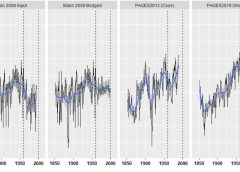
Below are 5 series of calculated Asian tree ring data (1850-2000).
Over recent years, and with the help of some good’ol tweaking and manipulation, the series materializes an impossible-looking ‘closing blade’ during its final 50 years (1950-2000), going from a decline (Briffa 2001) to a “catastrophic” rise (PAGES2019):
As explained by Stephen McIntyre, with the help of @detgodehab….
The first graph is the original Briffa 2001 Asian series and shows a clear late 20th century decline; the second graph is the average of the Asian series in gridded MXD, sent by Briffa/Osborn to Rutherford and Mann, which then received Mann’s ‘input’ in 2008;
The third graph is the average of the (45) gridded MXD data as used in ‘Mann 2008’, and shows that Mann chopped off the offending/inconvenient declines and replaced them with some ostensible temperature data; while the fourth graph is PAGES2K (2013), which introduced a novel Asia reconstruction (Cook et al) from tree rings in which late that 20th century decline originally observed in Schweingruber data now does not exist. Closing values were similar to high values at mid-20th century. The difference was not reconciled by PAGES2K;
The final fifth graph is the most up to date PAGES reconstruction, i.e. the “Woke Reconstruction” as used in IPCC AR6. Contained in it is a subset of the PAGES2K Asia dset, the average of which yields what the AGW Party were likely seeking all along: a monster closing blade, an alarming ‘hockey stick’ of a temperature increase which they can use to forward their CO2-demonizing agenda.
“The decline is now in the Woke rear-view mirror,” writes McIntyre.
McIntyre asked two lead authors of PAGES2019 about the provenance of the Asian tree ring series, “but got nowhere.” They didn’t consider that they had any responsibility as lead authors of a Nature article to answer questions about their data.
Still, @detodehab was intrigued with the puzzling Asian tree ring chronologies and worked to reverse engineer their calculation, replicating the results to every detail. It’s hard for a statistical methodology to be so bad as to be wrong, but Mann’s methodology was one seemingly unique example: “It’s worse than anyone can imagine,” writes McIntyre.
Note, not ALL of the Asia chronologies are pathological, but the biggest blades most certainly are.
The ‘paki033’ chronology, one component of the Asia series, has 20 total iterations.
Looking at its evolution, it opens as nondescript series (V1) but then closes with a massive blade (V20) — and version 20 is where the iterations stop, with the creators seemingly now content with the results.
Below is a breakdown of the evolution of the data:
So how did they achieve such a stark rise?
“What happened to individual cores?” asks McIntyre. It all looked “very suspicious as a procedure.”
An obvious suspicion was that the monster blades were some sort of artefact, as opposed to being caused naturally by the climate.
As a test, McIntyre asked @detgodehab to see what happens when the last the 50 years of data was not used.
The findings justified the suspicion.
Excluding the last 50 years, paki033 produced a similarly big blade–just 50 years earlier:
For good measure, @detgodehab did a separate test excluding 25 years, and got the same big blade–just 25 years earlier:
So, at least with this chronology, it is very clear that the big blade being produced is bogus; man-made; an artefact of methodology and NOT in any way linked to climatic changes.
PAGES 2019, that most recent official iteration of global temperatures from 1850 (shown again below), irrefutably selects the worst and most bogus chronologies (claiming they were the best) and tricks the trusting reader, the purblind politician, the narrative-peddling reporter, and the meaning-seeking alarmist alike into thinking global temperatures have fired upwards in an unprecedented fashion.
This all matters greatly, of course.
The ENTIRE ‘climate crisis’ discourse is based on these fabricated findings — they are in IPCC reports, they are propagandized to the masses via the legacy media, and they are held up by supposedly educated ‘educators’ in schools and universities as definitive proof that “you kids are a cancer on the planet.”
Know, the increasingly extreme CO2-capping policies that our compromised politicians are hellbent on pushing are solely responsible for the plunge in living standards; and realize, the establishment are frantically blaming every Tom, Dick and Putin for this collapse when it is clear to all those whose eyes are their own that this is a fully intended and long-planned ‘controlled demolition’ of humanity’s hard-earned prosperity, prosperity chained to our access to cheap and reliable energy.
See the graph below … it is the only climatic dataset you need bother yourself with.
‘Perspective’ however does not forward totalitarian regimes quite as well as fantastical campfire tellings of the end of days.
For more from Stephen McIntyre, see his website climateaudit.org.


Good reading….AGW truly is the greatest scam in all of history.
One thing hiding the decline, another to let the public see climate in a historic perspective through the whole current inter glacial period.
This Youtube video is one of the best “Busters” of the AGW I have seen for a long time and even a hardcore “Greenie” would have a hard time explaining why a bit of warming would be a bad thing.
The Greenland Ice cores are are explained on site by one of the scientists. He explains that the lowest temperature we have had the last 10.000 years was 1874 about exactly what the TPTB has decided, was the ideal temperature of planet earth. Despite the “Climate Optimum” being 2.4C higher.
Save this video for whenever you need to explain to someone what utter BS they have been brainwashed to worship and fear.
https://www.youtube.com/watch?v=L1mjG_F8ppw
Fyi…Canaan Valley WV which is south of the Mason Dixon line has at the official 7Am Obs report ( 5/2/23 ) accumulated a half foot of Snow and it’s still snowing…28 degrees F….higher totals higher up in Elevation for sure…it snowed all day yesterday but the Strong May sun melted it all except in the Woods by early afternoon..
Canaan Valley,WV is setting record snow for May….here is a comment from the Official Observation person …..
“All you snow lovers out there…you’re witnessing Canaan snow history today. The current snowfall event here and what is yet to come in the next 48 hours will likely set new daily, monthly and even possibly state snowfall records for the month of May.”
Present time 8:16 AM 5/2/2023
…WINTER STORM WARNING REMAINS IN EFFECT UNTIL 2 PM EDT WEDNESDAY…
* WHAT…Heavy wet snow expected. Total snow accumulations of 4 to 6
inches, with 8 to 12 inches possible in the highest elevations.
Winds gusting as high as 45 mph.
* WHERE…Eastern Tucker County.
* WHEN…Until 2 PM EDT Wednesday.
* IMPACTS…Travel could be very difficult. The hazardous conditions
could impact the Tuesday morning and evening commutes. Gusty winds
could bring down tree branches.
It is MAY people not February!!!
Oh tell that to Sol, the Sun…He is the one causing this snow!!!
I sure wish all the information coming out made people WAKE UP. But just like the Election FRAUD data has not corrected the Stolen Election, this data will fall on DEAF EARS because the whole government, both sides, are all IN ON THE SCAM to bring the WESTERN World down to 3rd WORLD NATION STATUS.
People ARE waking up. I send it to my Friend who sends it to his Friends and THEY send it out to many many others. Ya’ll do that and more will wake up but most already Know that Global Warming, Snow a thing of the Past, Polar Bears numbers Declining and other CRAP has been proven therefore SEEN to be FALSE! Just send info to all and use these three sites…
electrverse.info
realclimatesceince.com
Notrickzone.com
These three cover all aspects of the liars like Michael Mann and others.
ENJOY!
Interesting but not surprising.
It’s like dissecting the mind of a psycopath, serial killer , at some point it grows tiresome and you save your effort by just ignoring every lie they spew forth. Until the puppeteers of our marionette politicians are eliminated, the destruction of everything noble will continue.
The use of questionable proxies have nothing to do with wild guess predictions of the future climate.
Those predictions are data free. They are not based on historical temperature data and there are no future temperature data. Climate predictions are just climate astrology.
Richard even real astrology uses real data, and was a mainstream science, the weather predictions, are very accurate, not so climate warming doomsday manipulation,.
Weather in Moscow: the second part of the May holidays will be cold
April Time returned in May.
Unlike April, May started with cool weather. The daily high on May 1 was the same as a month ago.
Until May 5th, the weather will be unstable, but not cold. The temperature will remain close to and slightly below normal. Sunny days (May 2nd and 4th) will alternate with rain (May 3rd and 5th).
From May 6th, the weather will turn cold. ‘THERE WILL BE AN ULTRAPOLAR INVASION’. Night frosts will return, the daytime temperature will drop to +7 … + 9. Hail will fall, an icy north wind will blow.
The cold will last until the end of the May holidays.
The air temperature is 3 degrees below the climatic norm and corresponds to mid-April.
—-
-May 3rd and 5th approx: Min: 2 Max: 14°C
With light snow on the 6th and frosts until the 9th of May, is it really a sign of spring there? Where I live these are Winter temps.
The (cold) anomalies become a trend, so ‘ironically’ they’ll report a ‘heat wave’ in May with records of 16…18°C. 🙂
https://www.gismeteo.ru/news/weather/pogoda-v-moskve-vtoraya-chast-majskih-prazdnikov-budet-holodnoj/
https://www.hmn.ru/index.php?index=1&nn=55232
The amount of deception and blatant lies what we are witnessing and get in to our faces are outrageous and criminal. All the politicians and journalists spreading these lies should be sued and put in to the jail. This climate change (CC = 33 = masonic conspiracy) robbery through various taxes and fees is outright criminal and our governments ows us everybody huge sums of cash what we have already paid.
When I started looking into climate change of of the first things I focused on, followed by the magnetic pole was our oceans. We have explored to next to nothing of our vast oceans that cover 2/3 of earth. Figured it was only logical that o2 and heat were coming from the ocean floor and volcanoes.
Well look what just popped up a few days ago. There is no doubt that something big is brewing and almost all of it has to be related to our magnetic pole and the sun as well.
“With only one-quarter of the sea floor mapped with sonar, it is impossible to know how many seamounts exist. But radar satellites that measure ocean height can also find them, by looking for subtle signs of seawater mounding above a hidden seamount, tugged by its gravity. A 2011 census using the method found more than 24,000. High-resolution radar data have now added more than 19,000 new ones. The vast majority—more than 27,000—remain uncharted by sonar. “It’s just mind boggling,” says David Sandwell, a marine geophysicist at the Scripps Institution of Oceanography, who helped lead the work.”
https://www.science.org/content/article/it-s-just-mind-boggling-more-19-000-undersea-volcanoes-discovered
OF COURSE most of the supposed global warming is man-made … but the average layperson is unaware of what “man-made” means. The arbiters of the official record say that more datasets and revisions paint a more clear picture of the true global mean temperature (GMT).
What they DON’T say is that stitching together lousy datasets is, like bureaucracy, rife with inefficiency and prone to corruption.