
Heavy Snow Hits New Zealand; Mammoth To Extend Ski Season Into August; Lancet Distorts Heat Death Data; + Drop In U.S. Heatwaves Over Past 75 Years
Heavy Snow Hits New Zealand
Heavy snow hit the likes of Canterbury and Otago on New Zealand’s South Island over the weekend. MetService said it was difficult to say exactly how much had fallen –isn’t that their job?– but from the photos, totals look sizable.
“It’s not surprising to be getting a fair bit of snow because the temperatures have been really cold down south,” said MetService meteorologist Alwyn Bakker.
Roads in and out of Tekapo, for example, have been closed due to the heavy accumulating snow. This has proven problematic for Aucklander Sam Tutty who is stuck in a Tekapo Airbnb.
“We’re doing little else at the moment, just keeping an eye out for the next snow update to see if the roads will be open,” said Tutty. “The plan is for us to fly back to Auckland today, fingers crossed that would still happen.”
/cloudfront-ap-southeast-2.images.arcpublishing.com/nzme/ARHLDVLZ3REYFMPG6ZZDEBCE7A.jpg?ssl=1)
/cloudfront-ap-southeast-2.images.arcpublishing.com/nzme/K5JCS3FUAZEGPCVMPEL5GIEGNE.jpg?ssl=1)
Mammoth To Extend Ski Season Into August
The AGW cabal may not like it pointed out, but the Western U.S. endured a historically cold and snowy winter of 2022-23, the remnants of which continue to extend well-into summer.
Mammoth Mountain, California, just announced another ski season extension, pushing its skiing operations into August.
The resort, which previously stated that it would remain open through the end of July, will now close on Sunday, August 6.
This is only the third time in Mammoth’s 69-year history that it has offered lift-accessed skiing in the month of August–the others being 1995 and 2017 (so an increasing trend).
The extension announcement comes on the heels of a historic winter.
Mammoth blew past its previous snowfall record last season, notching-up a whopping 715 inches of snow.
Lancet Distorts Heat Death Data
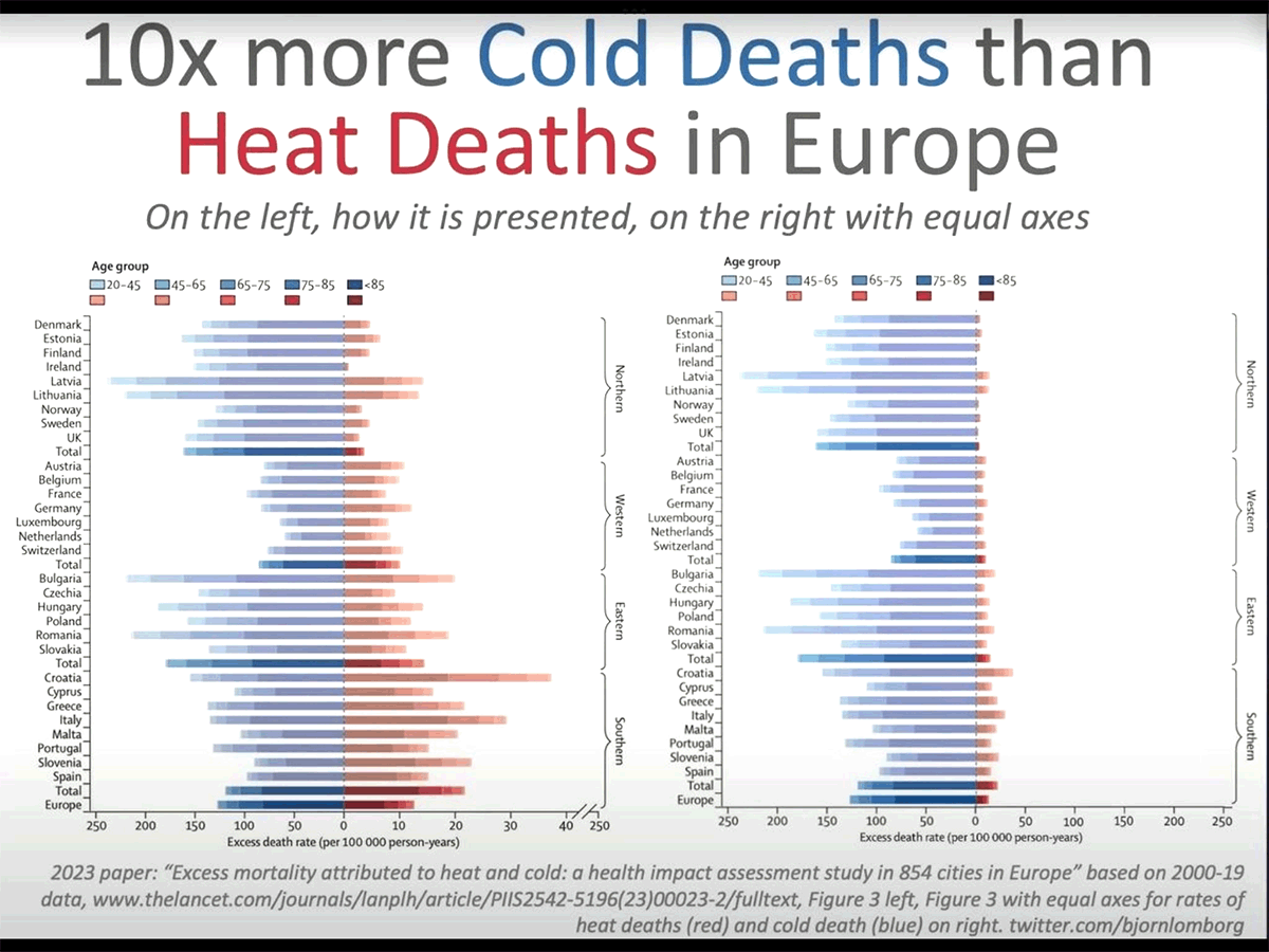
One of the world’s top scientific journals is using graphic design tricks to forward a political agenda.
Not enough people were dying from the heat, so The Lancet ‘distorted’ the axis so as to bend the fabric of reality.
“Welcome to government-science,” writes Joanne Nova.
Below is chart in question–on the left, while on the right is Björn Lomborg’s corrected version.
The chart’s fabricators have made 10 excess heat deaths look ‘bigger’ than 50 excess cold deaths.
To achieve this the authors used a combination of fairy-unicorn-dust and horse shit.

Patrick Moore on Twitter gives a more mature explanation: “The journal “Lancet” published the chart on left with unequal X-Axis* to downplay the fact that cold causes 10X more deaths than heat …This is disgraceful for a supposedly scientific journal.”
Joanne Nova continues, pointing to legacy media outlets pushing “heatwave porn” 24/7 in an attempt “to scare people about normal weather, while politicians try to justify spending billions to “cool” the world. These graphs hide the crime: increasing the cost of energy will kill far more than mythical cooling could ever save.”
Facts and needless human suffering don’t matter when it comes to forwarding The Narrative, of course, even for The Lancet which is ‘celebrating’ its 200th anniversary this year, reputation now in tatters. And for what? For the sake of appeasing today’s totalitarian forces. Hardly worth it. History lasts nigh-on forever — it remembers backbones well; cowards poorly.
“It’s a sign of desperation,” concludes Nova.
Drop In U.S. Heatwaves Over Past 75 Years
The mainstream media is once again milking the Northern Hemisphere’s summer months, proclaiming the end is upon us as the pockets of the U.S. and China touch 50C (122F). Scientists, in turn, are instructed to parrot that your CO2 emissions are making said heatwaves longer, more intense and more frequent — even though the data on that clearly state otherwise.
Official figures from the U.S. Environmental Protection Agency (EPA) show a decline in U.S. heatwaves stretching back 75 years. EPA data for 1,066 weather stations across the U.S. show a total of 863 locations, or 81%, reporting either a decrease or no change in the number of unusually hot days.
The percentage of the United States that reaches 38C (100F) sometime during the year has plummeted since the 1930s.
The below graph below illustrates that fact, showing that since the mid-1930s the number of U.S. stations logging at least 100F has fallen by a half. Moreover, it shows the trend sharply decreasing since the turn of the century.
The establishment can deploy those fiery ‘reds’ on their weather maps all they want, but the data don’t lie:

Writing for Climate Realism, the U.S. meteorologist Anthony Watts refers to the graph below from the EPA which shows that heatwaves were much worse in the 1930s, well before the onset of CO2-induced catastrophic climate change.

Also worth noting, the EPA’s chart –in line with ALL other official collections– fails to take into account the urban heat island effect, a factor that scientists such as Dr Roy Spencer say is key in the creating of the AGW Party’s up-trending temperature charts.
The establishment favors poorly situated thermometer stations over good (rural) ones.
The vast majority of stations reporting higher temperatures are located at airports or ‘concrete-rich’ sites that create heat biases.
A research paper found that 96% of U.S. stations were poorly sited and so prone to non-climatic heat additions. Much of the heat bias was found to occur in the minimum overnight temperature as tarmac, concrete and buildings released heat, giving daytime temperatures a head start and enabling them to reach higher than expected maxima — a phenomenon not seen in rural stations.
Despite what the media prints, observes Watts, “real-world” data show heatwaves are not getting worse.
“This flies in the face of opinions by climate scientists cited in the mainstream media which seem wedded to the narrative that climate change is causing a crisis, despite data to the contrary,” he adds.
Fear is the establishment’s biggest weapon. It prevents us from thinking. The emotional panic that accompanies fear actually shuts down the prefrontal cortex, the rational thinking part of our brains. A populace that stops thinking for itself is a populace easily led, easily manipulated, easily controlled.
However, as soon you reject the fear-mongering, the control freaks lose all power over you, you turn the tables. A free-thinking individual is THEIR biggest fear as calmly rationalizing a situation exposes the gargantuan cracks in their exaggerations.
So to the compliant alarmist out there: heatwaves are decreasing and cold-related deaths far outstrip heat-related deaths–as per the official figures; but I’m going to assume you believe otherwise–as per MSM story telling. How do you square that?

Hi,
I would be interested if those heatwave statistic also exit for Europe?
Does anybody know?
All european weatherstatistics were corrupted tens of years ago when the temperature-measurments were changed from one meter recording form fixed devices into satellite measurements at an estimated 150 cms height . In order to be able to compare the old with the new measurements all historic data was homogenized , a better term would be greenwashed by lowering the older records with 1,5 degrees celsius to the near present with 0,5 degrees celsius by all european state-controlled meteorologic institutions in a coordinated fashion most probably upon instagation by the united nations ipcc or other green-controlled super-centralised organisatons . It is good to know that any centralisation always is leading to more lies , manipulation , corruption through lack of control by the population of our earth and therefor ought to damned and forbidden as a kind of gods or natural law which overrules always any existing law or scheming of law .
Very Nice Read!
Thanks for being there and keeping it as real as possible in this Brave New Clown World!
Here are a couple of past articles from the Lancet that shows that cold or cool weather causes many more deaths than hot or warm weather.
The cold weather we have every year causes about 4.6 million deaths a year mainly through increased strokes and heart attacks, compared with about 500,000 deaths a year from hot weather.
‘Global, regional and national burden of mortality associated with nonoptimal ambient temperatures from 2000 to 2019: a three-stage modelling study’
https://www.thelancet.com/journals/lanplh/article/PIIS2542-5196(21)00081-4/fulltext
This article from 2015 says that cold weather kills 20 times as many people as hot weather and that moderately warm or cool weather kills far more people than extreme weather. Increased strokes and heart attacks from cool weather are the main cause of the deaths.
‘Mortality risk attributable to high and low ambient temperature: a multi-country observational study’ https://www.thelancet.com/journals/lancet/article/PIIS0140-6736(14)62114-0/fulltext
Always look forward to Monday…Thank you for your great work.
One of the charts is from here…
https://realclimatescience.com/2023/07/red-hot-map-vs-reality/
Hi Cap. Can you email me the source for the 100 degree F frequency chart? It would be helpful if all your stuff was sourced. It looks like Tony Heller’s work.
Thanks
Don
PS I will send a contribution.
Hi Don,
I’ve been trying to contact you via cap@electroverse.net but that email account is no longer working–for some unknown reason–so I’ll message you via here instead. Thank you very much for your recent donation. it is greatly appreciated. (And yes, that graph was lifted from Tony Heller’s realclimatescience.com, though I have since misplaced the exact URL).
Thank you again,
Cap